Tuesday, 27 November 2012

Issue #7

Welcome back to print central!

First up we have my mono-print which I neglected to include an image of in my last post;


As an actual piece of art, I don't think this was all that great, but it was good to go into mono-printing with a cohesive image to work at as opposed to just messing about like before. Good preparation for further stuff then, particularly my nerve map thing.

Here's the three woodblock prints I made t'other day;


Honestly, I'm quite happy with these prints. They're the first woodblocks I've done, and I really found this medium much more easy and enjoyable to work through than lino-printing. I actually found the wood (fakey kinda glue-and-sawdust stuff I know, but y'know) way easier to carve than the lino, and also the fact it's not in any way warped or liable to bend all over the shop was a bonus.
Though it's hard to see with the lighting in these shots, there are slight grain marks from the wood. Initially I was pretty unhappy with this, but after the black was printed the look of 'em really improved. Particularly on the last one; the orange really stands out and I really like the slight static-like graininess; it gives it a weird, slightly creepy feel which is always a good thing!

Anyways, returning to where I think I left off last post, updates on the Jim-Sized Nerve Thing (working title)!

Since I drew in the nerves the other day, I've been looking at a lot of stuff by Alex Grey. He's rather awesome by the way, and applies to my project in a seriously big way. Examples? Of course:


This is some of the best artistic imagery I've seen or at least been able to find depicting the anatomy of the human body, particularly within a setting of some kind of 'space'; in this case mainly the spiritual or personal space. 

After seeing Alex Grey's works, I had a bit of a spurt of creativity; I went back to and have begun developing a brief idea I had a couple of weeks ago of drawing the nerves of whatever body parts (hands at the time) extending out of the body, into the physical space the body is occupying. Literally sensing your space. So yesterday I marked up and carved out a fresh woodblock of a head with the nerves flying out the top, hopefully not like in The Thing....


...and also sorted out Jim-Sized Nerves Thing Mk. II in this vein of thought. I think it looks way cooler now.


It's strange, I've tried to move a bit away from the whole nerves being like tree thing a bit since Michael Canning voiced his cautions about it last week, but to be honest it just seems to occur naturally; the two things are undeniably similar, especially when you go outside the restrictions of the natural layout of nerves and start putting them wherever the feck you like.

So yeah, I started doing the mono-prints for this today, and managed to get the head and shoulders done; images next post when they're dry!




Tuesday, 20 November 2012

Issue #6

Lots more printing has been had over the past few days;

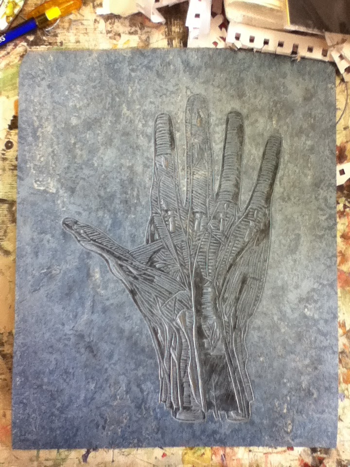
I've been doing a lot of work with the nerves of the hand, and the imagery thereof, going a tad more surrealist than expected ever since someone pointed out how tree-like they looked. As Michael Canning said to me, this is in danger of being a tad straightforward and simple, so I'm going to try and be a bit more abstract from now on with the whole nerve thing. A challenge with such a precise, scientific subject matter but a challenge is nowt but good!

Anyway, I made a mono-print and lino-print based on this, and only today I made three different woodblock prints which are presently ensconced in the print rooms drying.


It came out a tad patchy, but sure for a fairly large lino done up in the studio without the press or good ink I'm happy enough with how it turned out. 


That's the wood itself for the woodcut prints I made earlier today. I quite like the whole nerve grass, nerve hand-tree and nervey roots images, but I suppose it could be a bit simplistic.

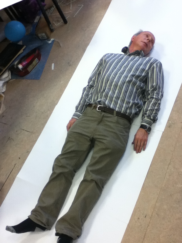
I made a start today on my life-size nerves mono-print. First I pulled a Caravaggio and used this dead Jim I found in the studio so I'd definitely have the right proportions etc.


I then drew in a load of nerves from various images;


So the plan is to make a load of small mono-prints on Thursday, then piece them together and form the whole Jim Nerves image!

Saturday, 10 November 2012

Issue #5

This week's unfortunately not been quite as productive as others, time for some self-inflicted arse-kicking!

But it's been interesting; I recently went to Des' print workshop which, being very interested in pursuing print next year, I found highly interesting. The next day I went down to the print rooms and began experimenting with mono-printing. This I found highly enjoyable as before coming to LSAD I had only made lino-prints, and with the water-based inks of school.

To start off with, I made a couple of mono-prints using the method of just marking the paper over the acetate, leaving the mirrored ink image on the other side;


Obviously, being the first mono-prints I've ever attempted, these didn't exactly come out as masterpieces, but it was an enjoyable, interesting experiment in the practise.

After this, because I had momentarily forgotten how to make proper mono-prints, I made a couple in which I, like with the proper method, removed the ink on the acetate in whatever design I chose. I then simply laid a piece of paper onto the acetate and used a roller to print it.


Though the image each time came out slightly indistinct depending on what kind of line I had marked, I really like how these look. I think the marks of the roller provide an interesting background pattern, almost giving the images a bit of a cubist feel. 

Thankfully Des then entered the room with another group doing a workshop so we were quickly reminded how to properly make a mono-print. I made another fairly simple face image just as a way of toe-dipping the whole Proper Mono-Print thing.


I quite liked how these came out, especially the coloured one; I love how much better these oil-based inks look compared to water-based ones!

These basic starting off prints have really taught me a lot about mono-printing, and I think once I start making these kinds of prints with a bit more thought and care into them I should get some better results.


Monday, 22 October 2012

Issue #4

Just a quickie.

Firstly, remember my wee look into the world of hand nerves?


Cool. So, I've started looking into this area a bit more, as well as beginning a lino print (applause, applause).

So I firstly made a pen drawing of this image to work from;


Then traced, did all the stuff, and now I have my lino which I'll be printing tomorrow hopefully:


Oh, also I popped along to Kieran Whitelaw's ceramics workshop last Tuesday. It was quite an interesting few hours, definitely produced for everyone there some interesting and unexpected results, particularly the ink drawings we made before working with any clay using bamboo sticks and whatever dipping instruments we fancied.


We then did a bit of work with clay, which was then fired and glazed by Kieran (not speaking in the third person) (not yet anyway) (hopefully I won't) (just keep an eye, yeah?).

I thought these were a tad rubbish but sure they're prettily coloured.


That's probably all for now folks, g'night!


Tuesday, 16 October 2012

Issue #3

Bon soir,

First up, just a quick round-up of a couple o' things I've done since the last few thangs.

I've started to take my ideas of the sense of touch and melding forms, imprints etc. to a more 3D setting, something I really enjoy doing much to my surprise having never done that sort of thing in the Leaving Cert.

These are a couple of plaster things I made of my hand in preparation for my wire hands;


After this I moulded lengths of wire around one side of the main hand (with the occasional broken finger as you can see) and mounted them first on paper as a basic beginning experiment;


I then made a more secure one, using a wooden tray-kinda thing to hold the wires, this time in an imprinted hand shape;


This whole sense of touch thing has also now led me to look at it more in terms of sensations, particularly pain, and through a more anatomical medium;


I've started looking at some images of the nerves of the hand, making a few sketches, and I'm hoping I can do something based on this theme in some kind of print, maybe lino;


Palmar nerves; deep ^

Palmar nerves; superficial ^


I've also been concentrating on researching some more artists in relation to my ideas and work, focusing somewhat on the theme of textures as suggested by Michael and GrĂ¡inne;


Idris Khan; "Birmingham Palace, London" and "St. Paul's, London"


Yun Woo Choi; magazine sculptures from the "Just Another Day" exhibition


Swoon; "Milton", "Ohne Titel", some other wall jobby


Tuesday, 9 October 2012

Issue #2

Afternoon,

Since the last exciting issue, I've decided to (as well as do some more stuff) look up and research some artists and see what inspiration I can glean from their works.


Firstly; Henry Moore and Antony Gormley; since taking out some books by them from the college library, they've had a considerable influence on my work and my approach to it.


These works by Henry Moore, "Two Grey Sleepers" and "Four Grey Sleepers" respectively had an immediate and profound effect on my project; they struck me for the way in which the sleepers seem to blend and meld into their environment and eachother. This appealed very much to my favourite idea of the sense of touch and all that stuff I was on about last issue.

I made a couple of things based off of this train of thought straight away;


The work of Antony Gormley is another area which I have found gives an interesting point of view for this project; his use of space in pieces such as "Fruit II", "Field for the British Isles", and "Fathers and Sons, Gods and Artists".


In these works Gormley really uses space in very interesting ways; the invasion of a space and the presence of something over-sized in a place it seem it does not belong in "Fruit II"; the filling of a space in "Field for the British Isles", and the placement of objects in a space in such a way that maximises the artist's desired effect. 

These made me think more about the manipulation of space and how this affects the viewer; perfect for my other main idea of looking at space and manipulating it, covering up certain areas to change how it is sensed and seen, such as in these;


That's it for this issue, come back next time for more slendid tidbits in Issue #3!